So, a while back on a project, we had something terrible happen. A “stop the presses, no one go on lunch, everyone jump on a call” sort of situation.
Because, you see, a hover color was wrong. ON THE HOME PAGE!
Someone had changed a class, not knowing that it wasn’t used just over in one section of the site three clicks deep. That class was apparently also used on the homepage. And after the change was corrected, people demanded answers:
- Who did this (I did)
- Why did they do it (Because you asked me to )
- How did this happen? (Well, “thing A” was apparently related to “thing B” and I didn’t know)
- What can we do to prevent this in the future (ummmm. hrrmmm)
I had broken a tiny little piece of the brand, and I didn’t want to make that mistake in the future. So, this is how I did that.
First, some background
This, like so many of my projects, is a front-end + CMS implementation. The front-end is a Handlebars + SCSS + JavaScript setup. With Webpack and Gulp, we generate a watered down, static version of the site.
Back-end developers take our compiled CSS and JS and deploy it to the staging and live sites.
If we make any HTML changes, the back-end guys copy those changes in their MVC .net project.
So what we need is something to catch brand errors ideally during local development, but also during pull requests (we’re using Bitbucket).
So this is going to have two major steps here:
- Organizing and defining your brand
- Writing the unit test against your brand
We also have the bonus step of adding this all to BitBucket Pipelines.
This is a flow that will work for any CMS+Frontend team, whether it’s Tridion, Kentico, or Adobe AEM.
Organizing and defining your brand
If you feel like you’ve got a good handle on your brand from the SCSS perspective, skip this.
Start with a Brand / Style Guide Page
In our front-end repository, we had a page dedicated just to displaying brand elements. It is very unoriginally called style-guide.html.
Because we are using the Typography Baseline, which styles every typographical HTML element, our style guide includes all those elements. But, it also contains other things that we consider a critical part of our brand:
- Interactive elements like links, buttons, inputs
- Theme components like backgrounds and icons
- Content containers like quotes and tables
So, our style-guide.html page is a 1-stop shop for how anything and everything can/should look on a page.
Buttons and Inline-interactive Elements

We present all the varieties of our buttons on all the combinations of backgrounds they can be seen on.
Content Types and Forms
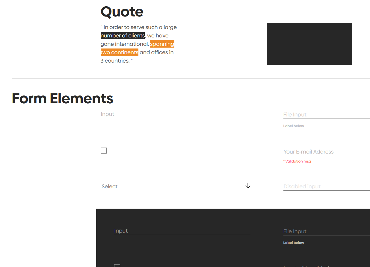
We do the same with our forms, too. We don’t show the “contact” form our “register” form. We show all form elements in all possible backgrounds.
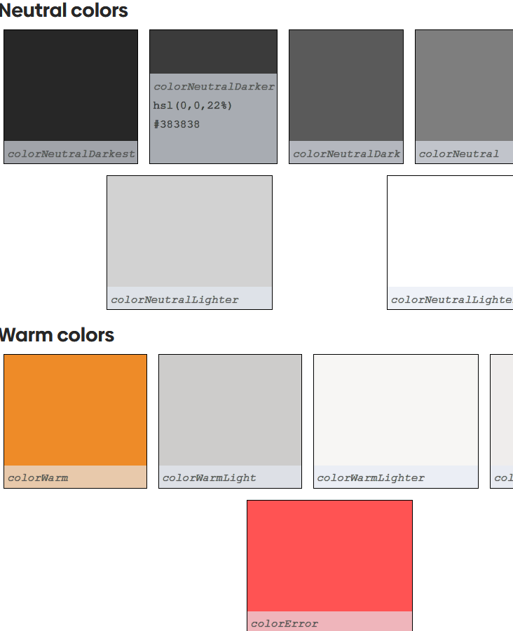
Color Palette and Brand Colors
So, the first step to unit-testing your brand is to have a page that can show all of your brand.
If you’ve haven’t done this, copy-pasta the HTML page from the Typography Baseline as a starter. Then add all the form inputs and build out a table. Bonus points for showing those theme elements.
Next, Centralize the Brand
Our Brand was already centralized, but if you haven’t done this, now’s the time! You want all of the core parts of your brand in just a handful o’ places.
You don’t have to organize your brand in exactly this way. You could do it in fewer or more parts. The important thing, though, is that you have it all collected somewhere.
colors.scss
// COLOR PALETTE
$colorNeutralDarkest: #222; // hsl(0,0,13%)
$colorNeutralDarker: #383838; // hsl(0,0,22%)
$colorNeutralDark: #5a5a5a; // hsl(0,0,35%)
$colorNeutral: #7f7f7f; // hsl(0,0,50%)
$colorNeutralLight: #bdbdbd; // hsl(0, 0, 74%)
$colorNeutralLighter: #d3d3d3; // hsl(0,0,83%)
$colorNeutralLightest: #fff; // hsl(0,0,100%)

$colorWarm: #ef8c23; // hsl(31,86%,54%)
$colorWarmLight: #cecdcc; // hsl(30, 2%, 80%)
$colorWarmLighter: #f7f6f4; // hsl(40,16%,96%)
$colorWarmLightest: #efeeec; // hsl(40, 9%, 33%);  visually this is the lightest, b/c less saturation

//  BRAND COLORS
$colorPrimaryWarm: $colorWarm;
$colorPrimaryNeutral: $colorNeutralDarkest;

$colorSecondaryWarm: $colorWarmLight;
$colorSecondaryWarmLighter: $colorWarmLighter;
$colorSecondaryWarmLightest: $colorWarmLightest;

// ELEMENT COLORS
$colorBodyText: $colorNeutralDark;
$colorHeadingText: $colorNeutralDarkest;
$colorError: #ff5252;
Take note that we named our color variables in such a way that they can’t be liars if our brand ever changes. No one wants color--blue to be yellow. No one.
Also, our color palette is not our brand. But our brand is our color palette. We recognize that developers may not remember what colorWarm is. So we created a second level of variables that are comfortable ways for us to describe our brand.
font.scss
@font-face {
  font-family: "biennale-regular";
  src: url("../fonts/biennale-regular.ttf") format("truetype"),  url("../fonts/biennale-regular.otf") format("opentype");
}

@font-face {
  font-family: "biennale-bold";
  src: url("../fonts/biennale-bold.ttf") format("truetype"), url("../fonts/biennale-bold.otf") format("opentype");
}

$fontFamilyBody: "biennale-regular", Helvetica, Arial, sans-serif;
$fontFamilyHeading: "biennale-bold", Helvetica, Arial, sans-serif;
$fontFamilyCode: monospace;
For our font families we try to avoid dictating the element it should be used for. Instead we just want to describe how it’s used relative to the content.
typography.scss
$lineHeightBodySm: 1.62;
$lineHeightBodyMd: $lineHeightBodySm;
$lineHeightBodyXl: 1.55;

$lineHeightHeadingSm: 1.375;
$lineHeightHeadingMd: $lineHeightHeadingSm;
$lineHeightHeadingXl: 1.24;

$biggestHeadingSm: 27px;
$biggestHeadingMd: 48px;
$biggestHeadingXl: 60px;

$biggerHeadingSm: 22px;
$biggerHeadingMd: 38px;
$biggerHeadingXl: 48px;

$bigHeadingSm: 18px;
$bigHeadingMd: 28px;
$bigHeadingXl: 40px;

$headingSm: 18px;
$headingMd: 20px;
$headingXl: 24px;

$quoteSm: $headingSm;
$quoteMd: $headingMd;
$quoteXl: $headingXl;

@mixin bodyText($lineHeight) {
  color: $colorBodyText;
  font-family: $fontFamilyBody;

  @if ($lineHeight) {
    line-height: $lineHeight;
  }
}

@mixin headingText($lineHeight) {
  color: $colorHeadingText;
  font-family: $fontFamilyHeading;

  @if ($lineHeight) {
    line-height: $lineHeight;
  }
}
Take note, again, how we named stuff. Even though we’re definitely using $biggestHeading for h1s, we’re aren’t going to say that.
We want to describe presentation not prescribe usage in our variable names. This has the side effect of also being a great way to describe our brand elements to non-developers.
Writing the Unit Test against the Brand
Because we’d already organized our brand, this is where we started. We knew we wanted to test a total of five things:
- Font size
- Color Palette
- Brand colors
- Element Colors
- Link colors
JavaScriptify your Brand
We created test/style-guide.test.js and put all of these things at the top.
// scss/vendor/_bootstrap-preset.scss
const fontSizeDefault = 16;
const fontSizeSm = fontSizeDefault * .875;
const fontSizeLg = fontSizeDefault * 1.125;

// scss/base/_colors.scss
const colorPalette = {
  colorNeutralDarkest : 'rgb(34, 34, 34)',
  colorNeutralDarker : 'rgb(56, 56, 56)',
  colorNeutralDark :'rgb(90, 90, 90)',
  colorNeutral :'rgb(127, 127, 127)',
  colorNeutralLight :'rgb(189, 189, 189)',
  colorNeutralLighter :'rgb(211, 211, 211)',
  colorNeutralLightest :'rgb(255, 255, 255)',
  colorWarm :'rgb(239, 140, 35)',
  colorWarmLight :'rgb(206, 205, 204)',
  colorWarmLighter :'rgb(247, 246, 244)',
  colorWarmLightest : 'rgb(239, 238, 236)',
};

// scss/base/_colors.scss
const brandColors = {
  colorPrimaryWarm: colorPalette.colorWarm,
  colorPrimaryNeutral: colorPalette.colorNeutralDarkest,
  colorSecondaryWarm: colorPalette.colorWarmLight,
  colorSecondaryWarmLighter: colorPalette.colorWarmLighter,
  colorSecondaryWarmLightest: colorPalette.colorWarmLightest,
};

// scss/base/_colors.scss
const elementColors = {
  colorBodyText: colorPalette.colorNeutralDark,
  colorHeadingText: colorPalette.colorNeutralDarkest,
  colorError: '#ff5252',
};

// scss/base/_variables.scss
const linkColors = {
  colorLinkNeutral: colorPalette.colorNeutralDark,
  colorLinkNeutralInterest: colorPalette.colorNeutralDarkest,
  colorLinkNeutralLighter: colorPalette.colorNeutralLighter,
  colorLinkNeutralLighterInterest: colorPalette.colorNeutralLightest,
  colorLinkWarm: colorPalette.colorWarm,
  colorLinkWarmInterest: colorPalette.colorWarm,
};
If it looks like we’re manually rewriting the brand that’s already in our SCSS, you’re absolutely right.
The brand isn’t supposed to change very often, so this is definitely the kind of thing we’re ok hard-coding.
Next, set up your testing
In order to know what a thing looks like in the browser, we need something that can use the browser in a headless manner. That means Puppeteer. And, we still gotta actually test something, so Jest seemed like a good choice since it can provide both the testing framework and an assertion library in one.
Install those libraries
Let’s install the things we need to do this.
npm install jest puppeteer jest-puppeteer
Create the configurations
Now, we need to configure the things. First we’ll do Jest, then Puppeteer-Jest.
jest.config.js
module.exports = {
  preset: "jest-puppeteer",
  testURL: "http://localhost:3000", // change to whatever your site runs on locally
  globals: {
    URL: "http://localhost:3000/",
    testMatch: [
      "**/test/**/*.test.js",
    ],
  },
  verbose: true,
};
The big thing is that preset being set to jest-puppeteer. This has to do with with how incredibly asynchronous Puppeteer is. You will regret it if you skip over that preset.
jest-puppeteer.config.js
module.exports = {
  launch: {
    headless: true,
    showMo: false,
    devtools: false,
  },
};
if you don’t have headless: true, it’ll open up a browser window which will make Bitbucket pipelines very, very cranky. Also you. You will not like this.
Create some commands in package.json
Because this is a handlebars project, we first have to have some HTML to run. NPM offers a very handle feature that, any command you create can also have a pre and post version of it, and NPM will be smart enough to run those before or after, respectively.
So here are our scripts in the package.json
  "scripts": {
    "start": "gulp --info-verbosity verbose --open",
    "build": "gulp build",
    "build:staging": "gulp build --staging",
    "build:production": "gulp build --production",
    "clean": "gulp clean",
    "lint:styles": "gulp styleLint",
    "lint:js": "eslint src/**/*.js -f table && eslint src/**/*.js -f table -o reports/js.lint.txt",
    "lint:js:fix": "eslint src/**/*.js --fix",
    "lint": "npm run lint:styles && npm run lint:js",
    "pretest:ui": "gulp buildTest",
    "posttest:ui": "npm run clean",
    "test:ui": "jest --maxWorkers=2",
    "test": "npm run test:ui",
   "posttest": "npm run lint"
  }
So, pretest:ui will run before test:ui, and it’ll build the site. Then test:ui will run, where it fires jest. then posttest:ui runs that tears everything down.
Finally, we have our test command with its post-test, where it evaluates the scss and JavaScript for styles conformance.
Prepare your test suite
Make sure your test suite can open your style-guide.html page
We’re using Puppeteer to open our page headlessly. But it’s a local page; It ain’t something on a file server. We don’t want to have to run a local server or use an existing server to run this test.
We’ll use the path library to help us out so that Puppeteer can open this in the file:// protocol. Basically, this is the same as double-clicking an HTML file and having it open up in your browser.
So style-guide.test.js file
const path = require('path');

// This means the file can be tested without having a server running;
// this assumes that the file has been _compiled_ though, via npm run:build
const pageURL = `file:${path.join(__dirname,'..','build','style-guide.html')}`;
In our case, the final product goes into a build folder. Your setup may vary so change this as you see fit.
Set it to open the page
So, after we established all our color variables, but before the first describe, we set a beforeAll that will go to the page in question.
What we want to do is go to the page and wait until everything has loaded. Then the fun begins.
beforeAll(async () => {
  await page.goto(pageURL, { waitUntil: "domcontentloaded"});
});
Give any hovers some room to breathe
We have a little bit of transition time on our hovers and focuses; they don’t change immediately. This lil’ feller is useful for waiting a tick before testing that hover
const asyncTimeout = () => new Promise((resolve) => {
  setTimeout(() => {
    return resolve();
  }, 200);
});
Write Some Tests!
We’re going to create some test suites using describe(). Let’s ease into this by first trying something easy, like a test for font-sizes.
font-size tests
Behold, our very first test for our brand!
describe('font-sizes at some break points', () => {
  test('font-size for medium windows is 1em/16px', async () => {
    const body = await page.$('body');

    const fontSize = await page.evaluate(body => {
      const bodyStyles = getComputedStyle(body);
      return bodyStyles.getPropertyValue('font-size');
    }, body);

    expect(fontSize).toBe(`${fontSizeDefault}px`);
  });
});
Let’s talk about what this code does:
- Gets the
bodyelement - evaluates the
font-sizeof that element with.evaluate() - uses a DOM method,
getComputedStyle(), to grab the calculated styles of the element - Returns the value of the computed font-size so that we get a variable called fontSize
- Runs an assertion where we’re expecting the font-size we got to match the fontSizeDefault we hard coded
Really, the special sauce in all of this is that getComputedStyle().
Now, let’s write another test for our font-size at a given breakpoint:
  test('font-size for large windows is 1.125', async () => {
    await page.setViewport({
      width: 1920,
      height: 1920,
      deviceScaleFactor: 1,
    });
    const body = await page.$('body');

    const fontSize = await page.evaluate(body => {
      const bodyStyles = getComputedStyle(body);
      return bodyStyles.getPropertyValue('font-size');
    }, body);

    expect(fontSize).toBe(`${fontSizeLg}px`);
  });
The only difference between this test and the first is that we use setViewport to… well… you know. Set the Viewport.
A Button test
This is the test I’d been waiting for. The one that will save me from future button problems. Ohhhhh man.
Test the button color in the default state
  describe('btn--black', () => {
    test('default border and color are black', async () => {
      const el = await page.$('.btn--black');

      const elColor = await page.evaluate(el => {
        const elStyles = getComputedStyle(el);
        const borderColor = elStyles.getPropertyValue('border-color');
        const color = elStyles.getPropertyValue('color');

        return {
          borderColor,
          color,
        };
      }, el);

      expect(elColor.borderColor).toBe(colorPalette.colorNeutralDarkest);
      expect(elColor.color).toBe(colorPalette.colorNeutralDarkest);
    });
});
The test here, in its bones, is not much different from the others:
- Get the element
- Evaluate the element
- Using
getComputedStyle, pull styles off of the element and return them into a variable, elColor - Run some assertions
Test a hover state
    test('hover/focus (interest) are warm', async () => {
      const el = await page.$('.btn--black');
      await page.hover('.btn--black');
      await asyncTimeout();

      const elColor = await page.evaluate((el) => {
        const elStyles = getComputedStyle(el);
        const borderColor = elStyles.getPropertyValue('border-color');
        const color = elStyles.getPropertyValue('color');

        return {
          borderColor,
          color,
        };
      }, el);

      expect(elColor.borderColor).toBe(brandColors.colorPrimaryWarm);
      expect(elColor.color).toBe(brandColors.colorPrimaryWarm);
    });
This is where that asyncTimeout() comes in handy. The bones are the same, with a small exception that we also add a .hover() to the element we’re testing.
Run your tests!
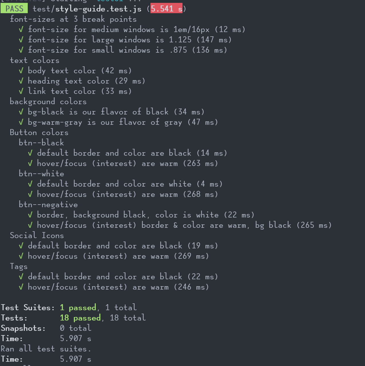
In our project, we ended up with 18 tests total to account for font size, background colors, and that our buttons and icons looked the way we wanted. We certainly could’ve expanded this to test every single part of our style-guide page. But this was enough to make sure that button colors and states weren’t going to change in the future without us catching it.
Bonus Step: Set up your bitbucket pipeline
Turns out, Bitbucket pipelines are kinda like containers. Or maybe they are docker containers.
Either way, we created a pipeline that runs on every pull request, so that no one accidentally merges in a break to the brand
This is written in YAML so obviously copying and pasting will be a nightmare. Sorry.
image: circleci/node:12.14.1-browsers

pipelines:
  pull-requests:
    '**':
      - step:
          name: Test the Pull Request
          caches:
            - node
          script:
            - apt-get update && apt-get install -yq libgconf-2-4
            - >
              apt-get update && apt-get install -y wget --no-install-recommends && \
                wget -q -O - https://dl-ssl.google.com/linux/linux_signing_key.pub | apt-key add -  && \
                sh -c 'echo "deb [arch=amd64] http://dl.google.com/linux/chrome/deb/ stable main" >> /etc/apt/sources.list.d/google.list' && \
                apt-get update && \
                apt-get install -y google-chrome-unstable fonts-ipafont-gothic fonts-wqy-zenhei fonts-thai-tlwg fonts-kacst ttf-freefont --no-install-recommends
            - sudo npm install -g gulp
            - sudo npm install -g eslint
            - npm install
            - npm test
          artifacts:
            - "reports/**"
Wrap up
Ok, So what does it take to unit-test that brand?
- Collect your brand into a few sensible locations
- Create a page that showcases your brand
- JavaScriptify those most important parts of your brand
- Set up some Jest and Puppeteer
- Write some test cases
- For profit, add it to a pipeline