Every once in a while someone asks specifically about how to manage CSS performance for a website. What if there’s a lot of components? What if there’s a lot of animations? What if there’s a lot of just CSS?
Here’s a high level strategy for approaching CSS Performance.

Establish Performance Expectations First
Before you do anything else, you need to establish what expectations are:
- What does “light” or “performant” mean?
- And what does “heavy” or “not-performant” mean?
This is both subjective and objective. Your objective questions are:
- Is this measured in time to transfer assets?
- Is total size of assets?
- Is it time to render the whole thing?
- Is it time to first paint?
It can be any combination of these things. But it’s up to you and your client to decide how you define “performant.”
If someone is coming to you and telling you to “optimize” or “fix” the performance, but they haven’t quantified the problem or the solution, stop what you’re doing and figure that out. You cannot make something more performant if you never knew what performant meant to begin with.
Prioritize Everything Else ahead of CSS
CSS performance should be the last thing you address on a site. Before I consider CSS, I consider all of these:
- Number of network requests
- Size of the assets transferred
- JavaScript performance
- Weight of HTML Document
- Order in which assets and modules are called
After I’ve gone through all of those things and made sure they’re in tip-top shape will think about CSS. Very often, I never get to CSS performance because all of those other things were much bigger problems.
Anyone who’s telling you to make your CSS more performant but hasn’t addressed these other issues is bike-shedding; they’re focusing on a small singular task that has no major bearing on the success of the project. Don’t let that happen.
You need to address these other issues so that you can determine if CSS performance even deserves your attention. I can tell you from experience that I get the fewest gains from optimizing CSS. Start where you’re most likely to win.
CSS Optimization Priorities
Once I’ve addressed other performance issues and determined that CSS needs attention, then I prioritize what I’m doing in my CSS:
- Reduce specificity
- Reduce duplicated properties to variables
- Merge patterns of duplicated properties into classes
- Increase cascade reliance
- Increase reliance on browser computations
- Simplify computations
- Remove 100% unused CSS
- Move non-global styles out of a global scope
- Deal with animations
Effectively, this is an inside-out approach where we
- Make sure the right things get the right styles
- Make sure the right styles are determined by the right parties
- Make sure the right styles are used at the right time
- Make sure the animation isn’t a pain in the ass
Make sense? The right party does the right thing at the right time. And also animations.
Make sure the right things get the right styles
“The right thing getting the right styles,” is another way of saying, “good selector intent,” and “good property intent.” Choose the element you mean to, and give it the style you mean to.
Reduce your specificity
90% of the time, this means quit.fucking.nesting.
Do not write
.productWrapper {
  .product {
   .title {
      font-size: 2em;
    }
  }
}
If you could just write
.product .title {
  font-size: 2em;
}
Better yet, bust your BEM out and make it
.product__title {
  font-size: 2em;
}
Shut up about BEM being ugly for five minutes and let me talk:
The original nested bullshit was 0,3,0
The simpler version was 0,2,0
But the BEM version was 0,1,0
Here’s why this matters:
The right-most selector gets the style.
Everything in front of it is effectively a “filter”; something that tells the browser how to exclude what gets the style. The more direct you can be, the less “filtering” the browser does. Short selectors are more performant because there’s less filtering involved.
Unnest your Sass. It’s gross and problematic anyways. Write CSS — even if you’re writing plain CSS in a Sass file.
Don’t nest until you absolutely need to. And when you do, don’t let specificity get above 0,3,0.
Make your selector as short as possible.
Reduce Duplicated Properties
This is DRY 101: Don’t Repeat Yourself
But I’m going to give you a guideline:
- It’s ok to repeat yourself once or twice
- It’s not ok to repeat yourself more than four times
And if you noticed there’s a gap there, good. That’s for “your discretion,” and you should use it because you know your project better than me.
If two rulesets are using the same property, don’t sweat it:
.g-header {
  color: #c0ffee;
}

// code ...

.g-footer {
  color: #c0ffee;
}
But If you find that you’re seeing that same thing used in lots of places, you have a problem:
/*Danger: same value repeated multiple times. What if it needs to be updated?*/

.g-header {
  color: #c0ffee;
}

// code ...

.g-footer {
  color: #c0ffee;
}

.g-aside {
  color: #c0ffee;
}

.g-nav {
  color: #c0ffee;
}
This is when it’s time to make this a variable. You’ve got variables in CSS now, so skip the Sass shenanigans:
main {
  --globalLabelColor: #c0ffee; /* look, a property I could change in one spot when marketing decides they need darkmode tomorrow */
}

.g-header {
  color: var(--globalLabelColor);
}

// code ...

.g-footer {
  color: var(--globalLabelColor);
}

.g-sidebar {
  color: var(--globalLabelColor);
}

.g-nav {
  color: #c0ffee;
}
Do this with all your theme and skin-like properties:
- borders
- colors
- font families
But then also do this with your spacing properties:
- padding
- margin
- font-size
- line-height
Chances are you’ve duplicated a lot of this stuff. Knock that shit off.
Merge Co-occuring duplicated properties into classes
Inevitably, we may notice that the same collections of patterns always show up together:
.g-header {
  font-size: 2rem;
  color: var(--globalLabelColor);
  padding: var(--globalSpacingVertical) var(--globalSpacingHorizontal);

}

.g-sidebar {
  color: var(--globalLabelColor);
  padding: var(--globalSpacingVertical) var(--globalSpacingHorizontal);
}

.g-footer {
  font-size: .8rem;
  color: var(--globalLabelColor);
  padding: var(--globalSpacingVertical) var(--globalSpacingHorizontal);
}
Fight your urge to go to Sass and make this a mixin or placeholder. You don’t need to.
Make this a useful and well-named class.
This is the problem with Sass placeholders and mixins: they obscure the repeatable design pattern from the content element that relies on that pattern.
Whether you make a mixin or a placeholder, the content that relies on what rendered from that never reflects the shared values. The mixin / placeholder created more fragile architecture.
A mixin won’t tie the shared values together at all in the final product. You won’t know how changing that mixin affects content at all. You’ve chosen same properties for different selectors:
@mixin globalContainer() {
    color: var(--globalLabelColor);
    padding: var(--globalSpacingVertical) var(--globalSpacingHorizontal);
}

.g-header {
  @include globalContainer(); // the compiled CSS will never tell you that this and g-footer have a relationship
}

.g-footer {
  @include globalContainer(); // // the compiled CSS will never tell you that this and g-header have a relationship
}
A placeholder merges these into a single ruleset in the final product. You’ll see these as inexplicably attached. You’ve chosen same ruleset for different selectors:
 %global-container {
  color: var(--globalLabelColor);
  padding: var(--globalSpacingVertical) var(--globalSpacingHorizontal);
}

.g-header{
  @extend %global-container; // final CSS makes this equivalent to g-footer
}

.g-footer {
  @extend %global-container; // final CSS makes this equivalent to g-header
}
Meanwhile this was an option the whole time: Each element in the markup could have this shared class and now you don’t have to give a shit at all what your global header and global footer had to do with each other. You’ve chosen for different things to be different, independent, and still share a trait:
.global-container {
    color: var(--globalLabelColor);
    padding: var(--globalSpacingVertical) var(--globalSpacingHorizontal);
}
Duplicated properties are the domain of variables
Duplicated patterns are the domain of classes and markup.
Content lives in your markup, and what you are doing is duplicating a design element amongst disparate types of content. So you need to see how those content elements are related in your markup.
Use a CSS class. It’s better for your team and your ‘tecture.
You’ll also save on the number of times the wrong thing gets duplicated.
Make sure the right styles are determined by the right parties
Increase your reliance on the cascade
Super fun fact: If you set the color on the <html> or the <body> you don’t have to set it again unless you want to override it. Same with font-size and line-height.
If you don’t do that at a root element then you’re gonna have to set it every time you declare your ruleset. I’ve actually been on a project where a team did not set a single style on a single HTML element and so color and font-family were set 100’s of times.
I’ve seen this. In production websites:
.title {
font-size: 1rem;
line-height: 1.25;
color: #333;
}

.paragraph {
font-size: 1rem;
line-height: 1.25;
color: #333;
}

.media-caption {
font-size: 1rem;
line-height: 1.25;
color: #333;
}
And I shit you not, the Smarty-pants McGees who did this thought they were clever by doing this in mixins and placeholders.
You see what’s happening here, right?
Styles inherit down; so let them
Set your styles at the rootiest of root elements and let them be inherited by children. If you really need to, set a property to inherit.
html {
font-size: 1rem;
line-height: 1.25;
color: #333;
}

.media-caption {
 color: inherit;
}
See what we did there? How we wrote a thing once-and-a-half instead of a dozen times? I bet the browser liked that.
Use relative sizing
Here’s another fun fact time. Using relative units saves file size and reduces redundancy.
How?
Let’s suppose you’ve written this (and yes, I’ve seen this a myriad of times, this is not a made-up example):
p {
font-size: 24px;
line-height: 30px;
}

h1 {
font-size: 40px;
line-height: 50px;
}

h2 {
font-size: 32px;
line-height: 40px
}

h3 {
font-size: 28px;
line-height: 35px;
}

h4 {
font-size: 24px;
line-height: 30px;
}

h5 {
font-size: 20px;
line-height: 25px;
}

h6 {
font-size: 16px;
line-height: 20px;
}
Let’s do some quick math here. Let’s divide line-height by font-size:
30 / 24 = 1.2550 / 40 = 1.2540 / 32 = 1.2535 / 28 = 1.2530 / 24 = 1.2525 / 20 = 1.2520 / 16 = 1.25
The math-minded amongst us would’ve caught right away that the ratio of line-height to font-size was identical. But those of us who aren’t so minded might have missed it. No judgement on you if you missed it; that’s not the lesson.
The lesson is do the math.
That’s because line-height is one of those properties that can accept a unitless value! This ultimately means that by doing a bit o’ math, we can save ourselves a lot of duplication:
p, h1, h2, h3, h4, h5, h6 {
  line-height: 1.25; // no unit. this will compute based on the computed font-size for each node that inherits this
}

p {
font-size: 24px; // line-height will be 1.25 * 24
}

h1 {
font-size: 40px;
}

h2 {
font-size: 32px;
}

h3 {
font-size: 28px;
}

h4 {
font-size: 24px;
}

h5 {
font-size: 20px;
}

h6 {
font-size: 16px;
}
We could simplify it even more by reducing the complexity of our top selector. Let’s rely on inheritance now:
body {
  line-height: 1.25; // all elements will inherit this line-height unless you override it!
}

p {
font-size: 24px;
}

h1 {
font-size: 40px;
}

h2 {
font-size: 32px;
}

h3 {
font-size: 28px;
}

h4 {
font-size: 24px;
}

h5 {
font-size: 20px;
}

h6 {
font-size: 16px;
}
But then, we’re not done. Why stop at line-height? Let’s go ahead and simplify font-size:
body {
  font-size: 1.5rem; // 24px
  line-height: 1.25;
}

h1 {
font-size: 1.66em; // 40px
}

h2 {
font-size: 1.33em; // 32px
}

h3 {
font-size: 1.166em; // 24 * 1.166
}

h4 {
font-size: 1em;
}

h5 {
font-size: .833em; // 20px
}

h6 {
font-size: .66em; // 16px
}
Not only have you reduced the selectors you’ve used, you’ve also told developers the relationship that those headings have to the base text size. You’ve told everyone that an h1 is 1.66 times larger than the base text size.
Not only that, you’ve explained that the h4 is the same size as base text.
And not only that, you’ve explained that line-height is always 1.25x the font-size.
You’ve managed to reduce duplication, reduce lines of code, and improve design intent. All by deleting stuff.
That’s how you do performance.
And this doesn’t just work for font-size and line-height. Look at font-size, border-widths, paddings, and margins. Chances are those all have similar proportions.
Do the math and let the cascade do the rest.
This is where we often peak in terms of gains. Everything after this tends to be more work for less gain.
Scroll to the end if you want.
Simplify calc()
First of all: don’t be anti-calc(). The browser is good at math; trust it. Simplifying calc() means:
- Using
calc()to solve things onlycalc()can solve - Being PEMDAS-minded
What makes calc() so cool isn’t that it can do math but that it can do browser math; it can do math across different units of measurement! That’s why you should eliminate stuff like this:
.cardSet--hasFour .card {
  width: 20%;
  margin: 0 calc((100% - (20% * 4)) / 5);
}
BTW if you were using variables, that actually makes this more complicated:
.cardSet--hasFour {
  --cardCount: 4;
}

.cardSet--hasFour .card {
  width: 20%;
  margin: 0 calc((100% - (20% * var(--cardCount))) / (var(--cardCount) + 1));
}
And before you ask: yes, I have seen examples way more complicated than this in production sites.
I often see this kind of stuff as a result of a CSS preprocessor where someone has used some combo of functions and mixins with calc to produce a grid. This is your performance hit: Your preprocessor is making your CSS bigger and giving the browser unnecessary work. (Are you noticing a trend where CSS preprocessors tend to cause problems?)
Meanwhile, you could be looking at this which gives the browser no additional work at all:
.cardSet--hasFour .card {
  width: 20%;
  margin: 0 4%;
}
If this isn’t preprocessor-generated and instead your goal is to illustrate why your left and right margin is 4%, do everyone a favor and just say that. Words were always an option:
.cardSet--hasFour .card {
  width: 20%;
  margin: 0 4%; /* 4 cards have 5 left/right margins so 20% / 5 = 4% */
}
BTW, while the previous case doesn’t need calc() at all, this here is a perfect example of when to use it:
.cardSet--hasFour .card {
  width: calc(100% - (.618rem * 2)); // only the browser knows 100% - .618rem
  margin: 0 .618em;
}
The guiding principle here is: Let the browser solve the problems only it knows how to
If you follow that principle then that means this rule is totally fine for the browser:
.cardSet--hasThree .card {
  width: calc(100% / 3);
}
Why?
Because the alternative is that you have to figure out how many decimals you need. If your computation is going to have a mantissa / significand that’s going to be long or repeating, let the browser decide how long it needs to be.
And this leads naturally into the point about PEMDAS. The calc() function follows PEMDAS, which is
- parentheses & exponents
- multiplication & division
- addition & subtraction
That means that the above ruleset could be simplified to:
.cardSet--hasFour .card {
  width: calc(100% - .618em * 2);
  margin: 0 .618em;
}
Simplifying calc() can mean letting PEMDAS do its thing without you getting involved.
But also, PEMDAS! What if your card has a border? Now it’s going to make a difference where you decide to subtract for border width:
.cardSet--hasThree .card {
  border: 1px solid;
  width: calc(100% / 3  - .618em  * 2 - 2px); // :) three in a row
  width: calc(100% / 3  - 2px - .618em  * 2); // :) three in a row
  width: calc(100% / 3  - .618em - 2px * 2); // :( two in a row
  margin: 0 .618em;
}
You know what would really simplify this computation and also help prevent a PEMDAS-related developer error? That’s right: adding some parentheses:
.cardSet--hasThree .card {
  border: 1px solid;
  width: calc(100% / 3  - (.618em  * 2) - 2px); // :) three in a row
  width: calc(100% / 3  - 2px - (.618em  * 2)); // :) three in a row
  margin: 0 .618em;
}
And BTW, I wouldn’t ever object to adding moar parentheses if only for the benefit of helping the developer understand the computation:
.cardSet--hasThree .card {
  border: 1px solid;
  width: calc((100% / 3)  - (.618em  * 2) - 2px); // :) three in a row
  width: calc((100% / 3)  - 2px - (.618em  * 2)); // :) three in a row
  margin: 0 .618em;
}
Being PEMDAS-minded is exactly what it sounds like: thinking about when and why you might need to be more explicit about your order of operations.
Doing that makes sure you don’t ask too much or too little of the browser.
Make sure the right styles are used at the right time
This is where most folks jump to immediately and they’re often wrong for doing it. Get all the other problems out of the way first and then figure out if you need to even care about delivering the right styles at the right time.
Remove the unused CSS
Get an idea of where your usage is worst with dev tools
Open up a web page in chrome, and crack open those developer tools. Then cmd + shift + p in Mac or ctrl + shift + p in Windows and type in “coverage” in the command window.
That’ll get you an overall coverage report:
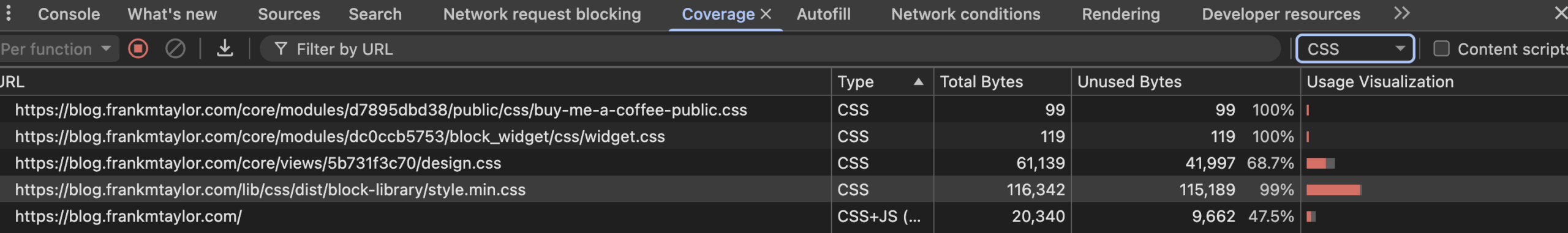
Now, from there click on one of those files so that you can see on a per-ruleset basis what’s not used:

So now that you know what isn’t used on a given page, you need to find out if any HTML has a matching CSS selector on the site.
I built a tool called SelectorHound that can help with that. It’s a command line utility that can scan a live site for either a single CSS selector or for the CSS selectors in a stylesheet. It can either crawl or use a sitemap. I’ve used it with great success to find out if I can safely delete a chunk of CSS.
Create page or component-specific CSS
This is where you want to try to balance browser cache with network requests. Don’t make the browser get what it doesn’t need, but do help it remember what it should.
First break out page-level CSS
What you often find out is that you have CSS that’s used on one page but not another. This tends to happen when page layouts / templates are different.
The most common division I see for this is homepage vs. not-homepage. If you have homepages or landing pages that are drastically different from your other pages, move all your layout-specific CSS to separate files. But another case is your search page. Ain’t nothing wrong with having four different CSS files in a large site:
- site.global.css
- site.homepage.css
- site.content.css
- site.search.css
Always focus on page layout first. Then focus on page-specific components.
Then break out component-level CSS
Do not target all components. You are interested only in components where the CSS size is high and the occurrence is low. Most often these are interaction-rich components like:
- sliders & galleries
- media players
- forms & controls
- data tables
Again, our goal is a robust browser cache and a manageable number of network requests. When you get to this point, I think there’s three reasonable options
- A web component that used scoped styles
- An internal stylesheet (i.e. a
<style>written into the page) - An external stylesheet
A web component has the benefit of preventing styles from “leaking out” and affecting other elements in undesirable ways. If the component only occurs once on the page, I think a web component is probably the best approach.
If the component occurs multiple times on the page, I wouldn’t want to see a web component writing out the same styles to the HTML document multiple times. So I could see either an internal stylesheet or an external one.
If it’s likely the user is going to go to another page where the component will again appear multiple times on a page, that’s where I can see the advantage of an external stylesheet because the next page load will be lighter since those styles are cached.
If you’re working with a content management system, this is really where you need to explore the full features of that CMS. Both Drupal and WordPress give you the ability to create component-specific CSS.
Optimize Animations
Animations are always the last thing I care about. But if I’ve identified that animations need some optimizations, it goes like this:
Animate fewer things
It’ll always be better to animate an <article> containing 100 <p> than 100 individual <p>. Try to animate the parent of many items.
Cautiously prime the browser for the change
Use will-change to tell the browser what needs to be optimized for an animation.
Don’t prematurely prime the browser
will-change has the unfortunate side-effect that it can really bork your layout. Don’t add it until you know you need it.
Also, don’t transition any stuff that doesn’t need transitioning. That’s just silly. Use good property intent.
Watch out for the animations and features that affect stacking context
Look at the list of properties that affect stacking context. Try not to use too many of these at ones. Sometimes you’ll end up with an unfortunate side-effect of using a property and to deal with it you write like 10 more styles.
I have studied the stacking context in-depth and I still don’t know quite how to write a blog post about it. This might be a case where I have to branch out and make a video. But just know it exists and there’s a handful of CSS properties that can affect it.
Don’t over-DRY
I am thoroughly convinced that animations are the one area where you need to give yourself permission to be duplicative and verbose. Don’t try to make an experience a composition of many animations where you really need one complex one.
It feels counterintuitive, I know. But premature optimization is the root of all kinds of problems.
Manage CSS Performance by Managing You (and your team)
All of this boils down to how you’re managing to produce code. And that’s a very unsexy thing to say to a product owner or tech lead who’s whining to you about paint times, but screw those folks.
Once you do all this stuff, now you have to keep doing it.
Just like real-life weight loss, it’s not the diet that makes you thin — it’s the change of diet as part of a greater lifestyle change.
This cannot be a single 13-point Jira ticket, epic, or even a project. It must be part of the ongoing development lifecycle.
So yeah, do all the other performance things first. But when it comes time to focus on CSS, you need to continually:
- Make sure the right things get the right styles
- Make sure the right styles are determined by the right parties
- Make sure the right styles are used at the right time
- Make sure the animation isn’t a pain in the ass